How to Read Charts When Trading
Success of any trading (crypto, forex or other) heavily depends on the analysis you do. It is a cornerstone of getting results consistently rather than on a luck basis. The key tools traders use in the analysis are of course different charts and graphs that for the most part represent the dynamics of either price or volume defined parameters. BROZBOT also uses charts and graphs to identify entry and exit positions. Although you don’t need to master it in order to make money we believe it is important to give you a rough idea on the most common charts you will see on exchanges and tools BROZBOT use when trading on your behalf.
Candlestick chart
Candlestick charts is the most common way of representing price moves. It contains more information as it not only shows price change based on the close market price but its movements within a certain period of time: each candle shows what was the highest and lowest price, what was open and close price. That is why this type of charts gained popularity amongst traders all over the world and is preferred over line charts.
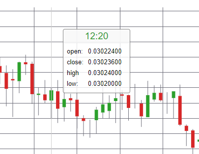
Let’s see how the candlestick chart is built. Each candle consists of three parts: the upper tail, the lower tail, and the body. The upper tail indicates the highest price traded while the lower tail shows the lowest price. However, sometimes there are no upper or lower tails, because opening/closing price is almost the same as lowest or highest price.
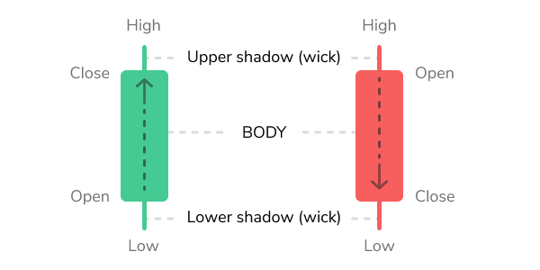
The body is usually coloured green or red. The color depends on whether the trend was “bullish” or “ bearish”, i.e. whether the closing price was higher than the opening price (green, bullish), or lower (red, bearish) at some specific period of time within the selected time frame.
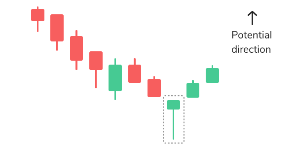
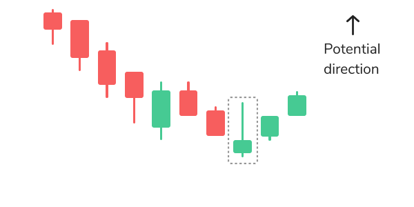
Various shapes of candles and their combinations give traders info about trends and their changes. There are more than 10 types of candlestick patterns, but in this article we will try to cover the most frequently occurring ones. The first one is hammer candlestick pattern which belongs to bullish patterns. It represents a short body with a lower tail, such pattern can be seen at the bottom of the downward trend. Inverse hammer also belongs to bullish patterns, and it implies that buyers are being in control of the crypto market.
The most common bearish candlestick patterns are hanging man and shooting star. The hanging man has the same form as a hammer, but it can be found at the end of the upwards trend. It means that buyers managed to increase the price of cryptocurrency again.
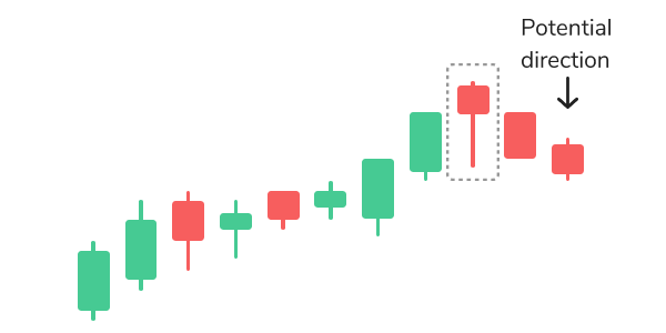
The shooting star is shaped the same way as the inverse hammer, but is formed in the upwards trend. The shooting star pattern might indicate that the uptrend is over and it is time for a downtrend.
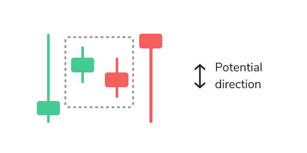
When there is no change in the cryptocurrency market, then you can see so-called continuation candlestick patterns. Dojis form when the market’s open and close prices are equal, and it’s shape is similar to a cross, but with a bigger body.
What is more, when you start exploring charts on crypto exchanges, you can also see several coloured lines:
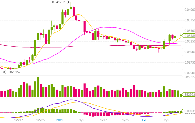
These lines are known as Moving Averages indicators, they are based on the average price of a coin based on its value for the past period of time. Usually exchanges show 3 moving averages: based on the close prices for the previous 7, 25 and 99 days. This indicator is one of the tools to determine trends and signals for entering and exiting position.
Market Depth chart
Market depth chart gives you an idea about Supply and Demand situation on the market. You can determine sell (red) and buy (green) orders without any difficulty. The green side shows a total number of assets that have buy orders at the current price, while red side shows the amount of assets with sell orders at the current price. The centre, where two lines meet each other, represents the current market price. If you place the cursor on any point on the green or red line, you will see how much exactly you could buy or sell (vertical axis) at some specific price (horizontal axis).
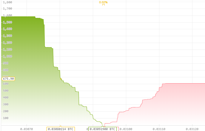
You should note that slopes and walls change very rapidly, capturing how things would happen at the time a buy or sell order occurs. Market Depth chart reflects whether the price of crypto will most probably increase or decrease. If buy orders exceed sell orders then the price will go up.
Next to the Market Depth chart, you can see the Order Book, which represents a real-time list of buy and sell orders.
The buy-side is usually displayed in green while sell-side in red. Event though it may look a bit different on various exchanges, the principle remains same. The buy-side shows open buy orders below the last traded price (known as “bid”) and the sell-side shows all current sell-orders above the last traded price (known as “ask”).
Conclusion
Reading charts is an essential skill that every trader needs to gain. The basic charts and explanations covered in this article, hopefully, will help you to get an overview about exchanges and to realize that reading charts is not complicated as it may seem at first.